OH, HI THERE!
Welcome to our humble abode! Also known as the Webafrica guidelines homepage - your one-stop brand shop for everything Webafrica. Not sure what our new wordmark looks like? We’ll introduce you. Need more detail on our fasterfast animations? We know just the gifs. It’s all right here, so how about you scroll on down and get to know us a bit better? You know you wanna.
LOGO
As an internet provider, we like to keep things simple. So, living up to our word, we chucked everything overcomplicated to the kerb and created a super straightforward logo formula with 2 key elements - a Webafrica icon and a Webafrica wordmark. Because why waste your time with heaps of boring rules when you can just have some fun with it?
OUR WEBAFRICA ICON A.K.A WILL
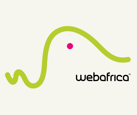
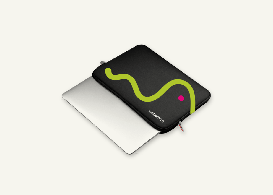
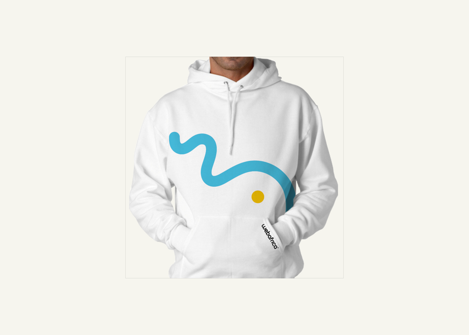
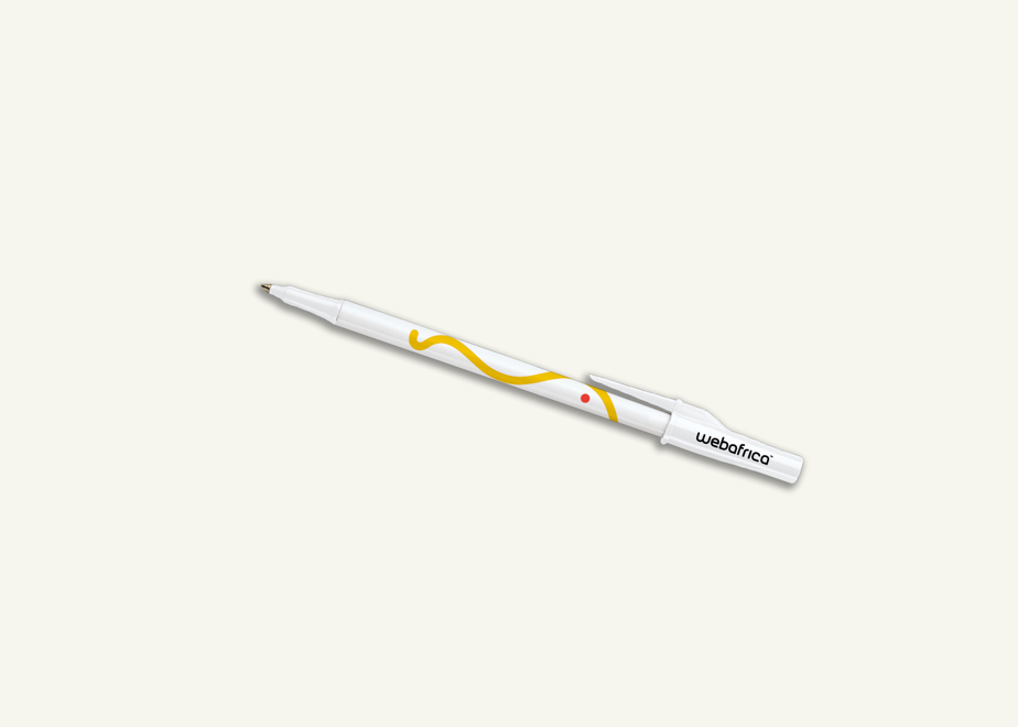
Remember Will? Our worm-shaped little friend? Well, in case you were wondering, he’s not just some abstract squiggle in top-notch shape. Will is a super-crafted icon based on the ‘W’ & ‘A’ in our name, and a not-so-subtle nod to our spontaneous, fasterfast, fun side. We created 2 icon versions to match our stacked and horizontal wordmarks, but let’s skip the details for now. Have a looksee alongside, why don’t you.

OUR WEBAFRICA WORDMARK
Our Webafrica wordmark is Will’s professional, more grown-up friend. Often paired with our icon, it ensures brand recognition from the get-go. Imagine the wordmark as the name of a person - without it, people would have no idea who we are. Which is why we’ve created 2 versions, a stacked and horizontal wordmark. Go on, have a peek.
WHAT A PAIR
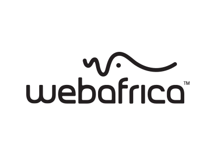
Our icon and wordmark are partners in crime. So, we went and created a horizontal and a stacked format that pair these two babies together. Yet, while they often hang out, their relationship is as flexible as your go-to Yogi masters. To see the various ways we brought these two to life, scroll on down to our 3 logo versions.
.png)
OUR LOGO VERSIONS
Since your creative freedom is important to us, we designed 3 Webafrica logo versions - so you have an interesting and relevant solution for whatever genius idea you’re bringing to life.
1. NEED TO SPEAK “PROFESSIONAL”?
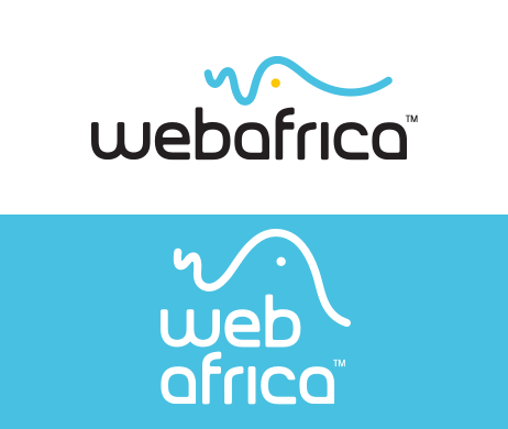
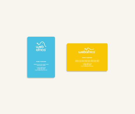
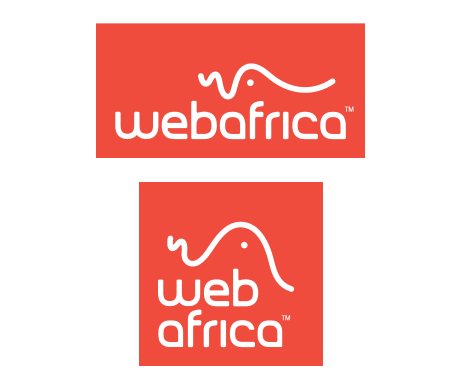
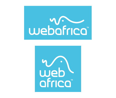
Logo on a white or Webafrica-colour background: On this version, the relationship between Will and our wordmark is pretty tight. Whether it lives on a white background or a Webafrica-colour background - if you’re working with tight spaces or need to tone up the professionalism, like on a business card - this version is your guy.
DOWNLOAD LOGO PACK 1 HERE2. LOOK AT ME!
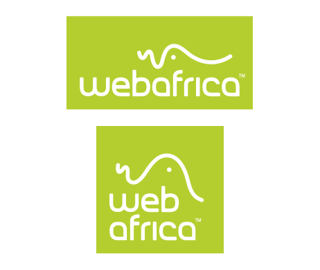
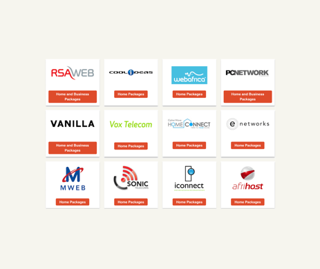
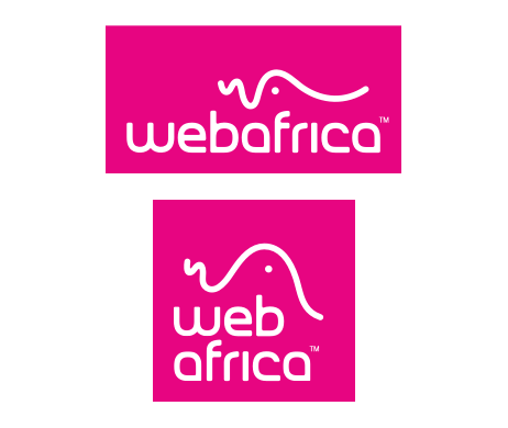
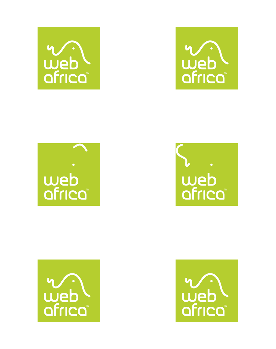
Logo in a Webafrica-colour block: Similar to the version above, this logo simply lives in a block. It’s been carefully designed with a unique amount of empty space in the top area, which provides Will with plenty of wiggle room when animated and also gives the logo an interesting edge. This option is ideal for maximum visibility within a space where it needs to compete with other logos, e.g. on Fibre Provider Portals.
To raise the bar even further, we’ve created animated GIF options, which can be downloaded here.
3. GO WILD!
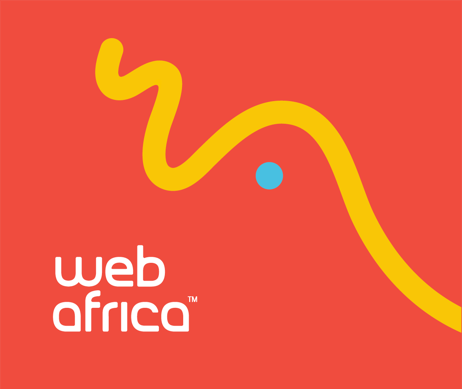
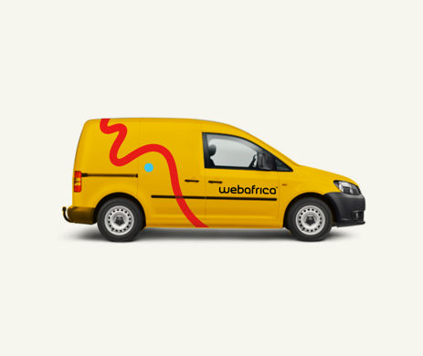
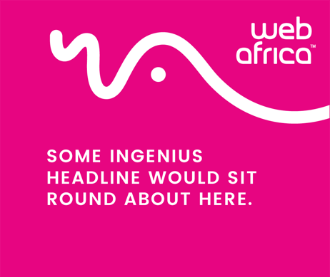
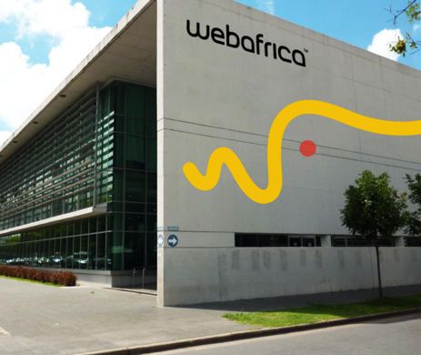
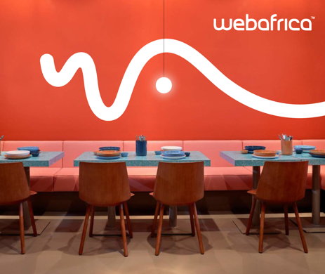
The logo that had one too many ciders: Will is so unique, we decided to let him shine in all his squiggly glory on occasion. The idea? Let Will loose on your layout. With this version, you have freedom to slot the Will comfortably in any space, from outdoor advertising to an identity mark on a letterhead. Enlarge him or simply move him about - just remember, and this is the important bit, to always make sure our wordmark is present as well.
Here are some basic rules to ensure consistency:
- Make sure the ‘W’ and ‘A’ are 100% visible and reads from left to right.
- If you wish to add a slight tilt to Will, the icon should never exceed 50 degrees when rotated.
- The wordmark should always sit comfortably between the icon and the edge of your layout, and make sure the proportions feel right.
NOPE. DON’T EVEN THINK ABOUT IT
Yup, we said it. There are some things that just don’t fly when it comes to our icon. We’re sure you already know what not to do, but just in case, we’ve created a little animation of no-no’s alongside.
Will is great, duh, BUT we wondered...why not make him even cooler by amplifying his character and bringing it to life through motion. While creating your own animation is an option, there is an existing bank of motion graphics that you can use, edit and oh yes, download below. To us, Will is that crazy guy at the office Christmas party, who’ll do pretty much anything after a few drinks - now who would contain such awesomeness?
LET THERE BE...MOVEMENT!
Just to give you an idea of how animation and movement add to Will’s character, here are a few examples. And if you do choose to create your own motion graphic, make sure to bear these pointers in mind:
- Keep it light, fun and quirky.
- Consider Will’s personality when adding movement and how it interacts with the given space.
- Always use a Webafrica logo as your starting or endpoint and make sure it animates left to right.
- Always use a rounded stroke that creates organic, rounded movements.
- While the dot and the stroke can move separately, make sure that they eventually end up together.
Banner example
SO USE IT, DARN IT!
Instead of using a static ol’ image why not make use of a fantabulous animation? In his basic form, Will might be perceived as quite simple but as a moving character, he’s a super-duper hardworking icon that embodies the overall essence of the Webafrica brand. So, we’d like to encourage you to utilise this dynamic animation where possible (think email signatures, PPT’s, TV stings, web banners etc.). Come on, we know you want to!
GRAPHIC ELEMENTS
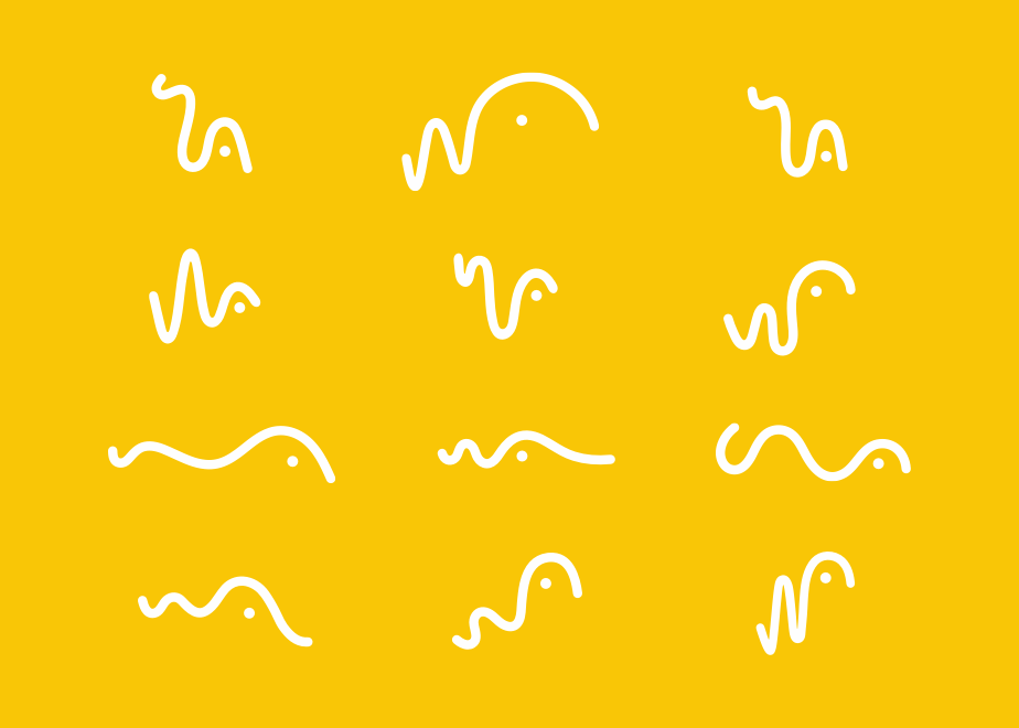
If it wasn’t obvious before, we love Will an awful lot. With his bouncing personality and ever-evolving, interesting shape, it just made sense to capture his character in a whole bank of graphic elements. So we went and documented his every single move and created a whole set of examples for you to download and play with.
WILL IN ALL HIS FORMS
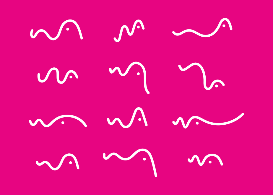
To give you an idea of the possibilities (and flexibility) that lies within this little guy, have a look below. The opportunities are endless! Quick to fit in any given space - Will can stretch, squash and bend until he sits comfortably within your layout. The only hard and fast rule - the ‘W’ and ‘A’ always need to be legible and read from left to right. So, flipping or turning him on his head is a big no-no, and to be honest, he kinda hates it.
KIND OF OKAY, BUT NOT REALLY
A situation might arise (but really shouldn’t) where you’re working with an awkward space and one of our graphics just doesn’t fit as effortlessly. So if the execution really calls for it, you can create your own Will graphic, bearing in mind the following basics:
- Always use a chunky, rounded stroke.
- Always place the dot within the curved area of the ‘A’.
- Make sure your new “Will” has the same ascender and descender as a ‘W’ and ‘A’.
- Keep the movement organic and spontaneous.
ICONOGRAPHY
Willy is our No.1 icon and for this reason, you can’t blame us. Yet, Will isn’t one for those little jobs done here and there. Willy needs to be the ‘piers de resistance’ eg. the shining beacon of Webafrica’s light. So we thought, why not create an assortment of fresh AF ‘look-alikes’ that take cues from Will’s fashion, personality, and accent to represent our brand online.
#TWINZIES
So what is their job really, you ask? To be functional - mainly for navigation and product/service/benefit communication purposes on our website. It’s like having a doppleganger...meaning you share similar features, but when put together, you still own that sense of individuality.
As you can see our icon set’s design is based on our original icon - a chunky outline, topped off with a little dot. You can add colour for extra emphasis, but black and white where appropriate is also A-okay. Please refer to our colour section to familiarise yourself with our colour palette and preferred colour combinations.
Please note: Keep the stroke width to a minimum of 3 px.
COLOUR
While our M.O. is straightforward, we’re pretty bold and in-your-face too. We like standing out, and with our vibrant colour palette, we do just that. In some cases, we say, fudge it - use em’ all but where necessary we like the idea of strategically allocating specific colours combos to certain elements as this allows for easy allocation and communication of our various offerings.
OUR TRUE COLOURS
So this what you have at your disposal and it’s pretty fresh if we do say so ourselves. We’re all about being fun, bold and playful (hence the cheery colour palette), but as they say ‘with great power comes great responsibility”.
It may sound serious, but in actuality, it’s pretty simple - on our website, we need to utilise our colours, so they make navigating our range of products easier for our customers. That way, it’s easy to differentiate between the services that we offer.
C 31 M 0 Y 100 K 3
R 181 G 206 B 47
HEX #b5ce2f
PANTONE 382C / 381U
C 0 M 20 Y 100 K 2
R 249 G 198 B 6
HEX #f9c606
PANTONE 7406C / 7404U
C 0 M 86 Y 80 K 0
R 240 G 76 B 62
HEX #f04c3e
PANTONE 179C / 179U
C 70 M 0 Y 5 K 0
R 72 G 192 B 225
HEX #48c0e1
PANTONE 298C / 2985U
C 5 M 100 Y 10 K 0
R 231 G 5 B 129
HEX #e70581
PANTONE 226C / 226U
C 0 M 0 Y 0 K 100
R 0 G 0 B 0
HEX #000
PANTONE BLACK C
WILL & HIS EXTENSIVE WARDROBE
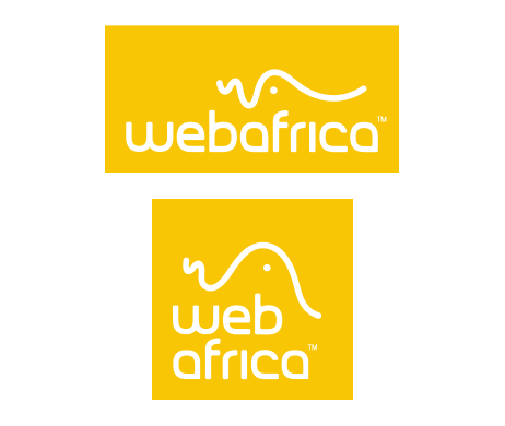
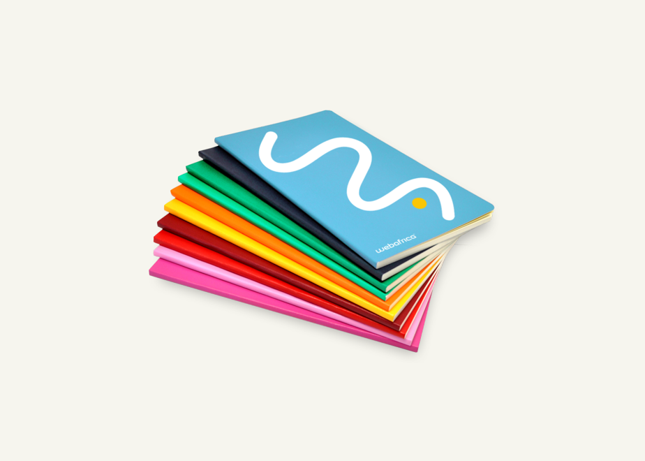
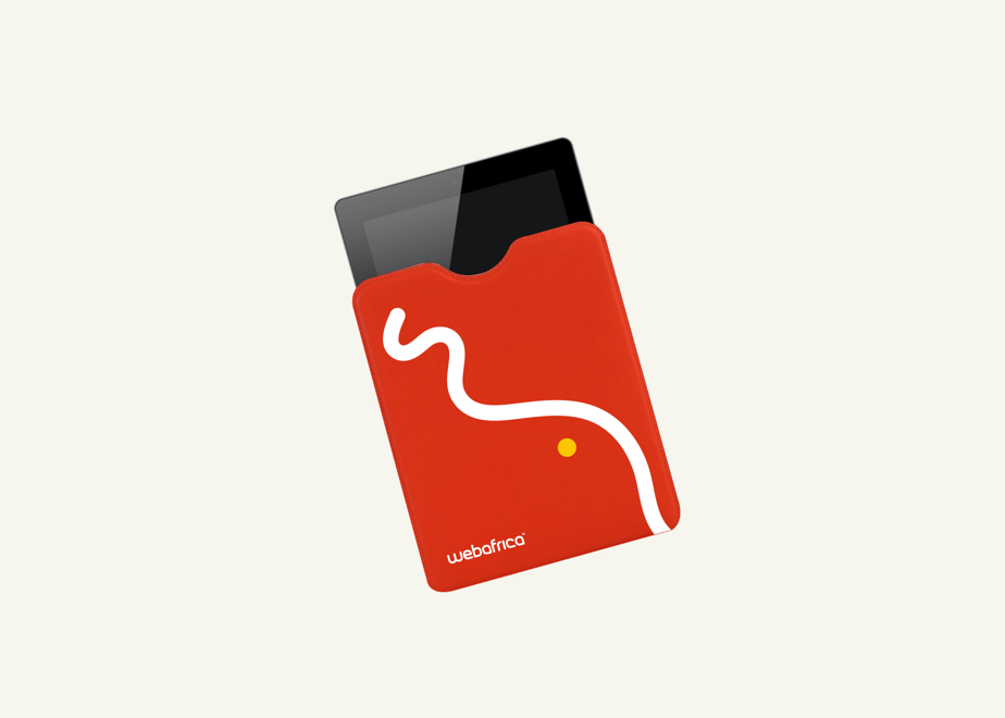
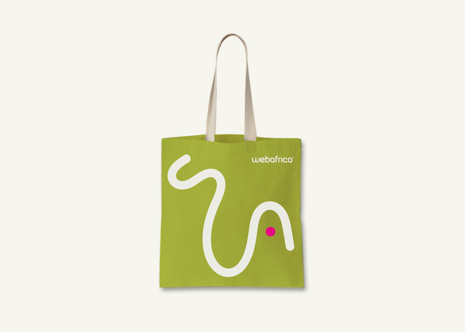
Like all fame-crazy stars, Will needed a big, colourful wardrobe to stand out from the crowd. Which is why we created a few snappy colour combinations that work best with our icon - all of which you can download right here.
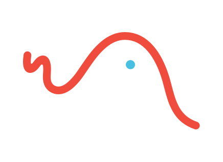
Colour on a white background
.png)
Colour on a Webafrica-colour background
WILL’S FAV COLOUR COMBOS
Much consideration went into what colour combinations worked best - we had to make 100% sure that the combinations not only meshed well together, but were also the best options for balance at any scale. So bear these pairings in mind, as they may come in useful when applying your icon or setting up advertising layouts.
Please note: As our icons originated from our Will icon, these colour combo’s are also applicable to our iconography.
TYPOGRAPHY
Our font choices needed to be bold and confident, yet down-to-earth and approachable (a little like George Clooney). Which is why we’ve chosen fresh, modern fonts with a friendly twist. Not only do they suit our personality but they look pretty damn good too. In some cases we jazz it up a bit with colour but where we need to dial it down to give other, more important elements the centre stage, we keep it clean and simple.
JUST OUR TYPE
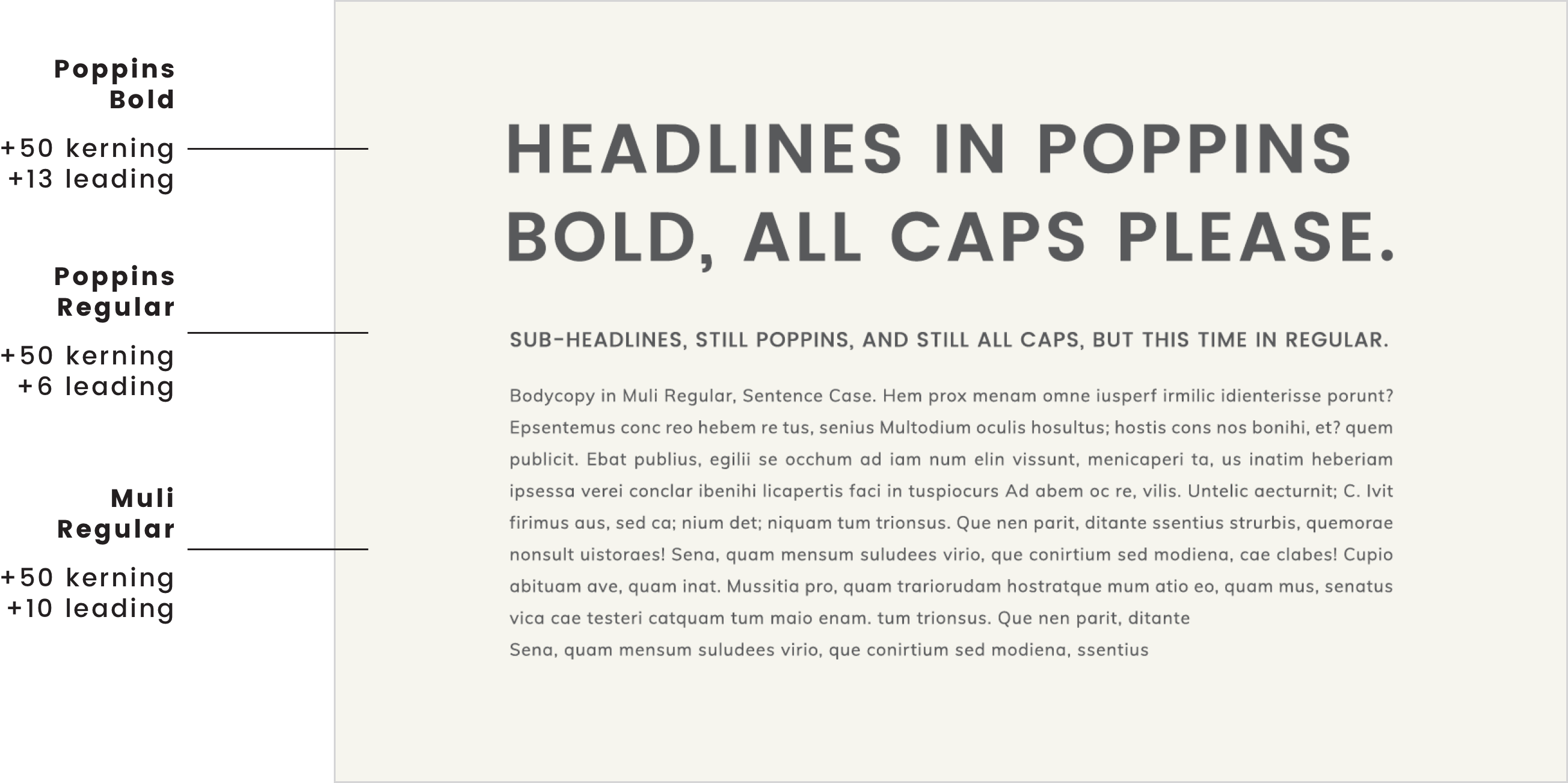
We chose Poppins to head our headlines. Combined with the easy-reading Muli, it’s the surest way to say professional yet genuine without saying professional yet genuine. What’s even better? These can be used for print and online, in application they’re treated slightly differently but nothing to stress yourself out about.
POWERPOINT? BUT, OF COURSE!
Powerpoint and Word aren’t our usual jams, but when important presentations call, in any format, we come running with default fonts that mimic our chosen typefaces above.
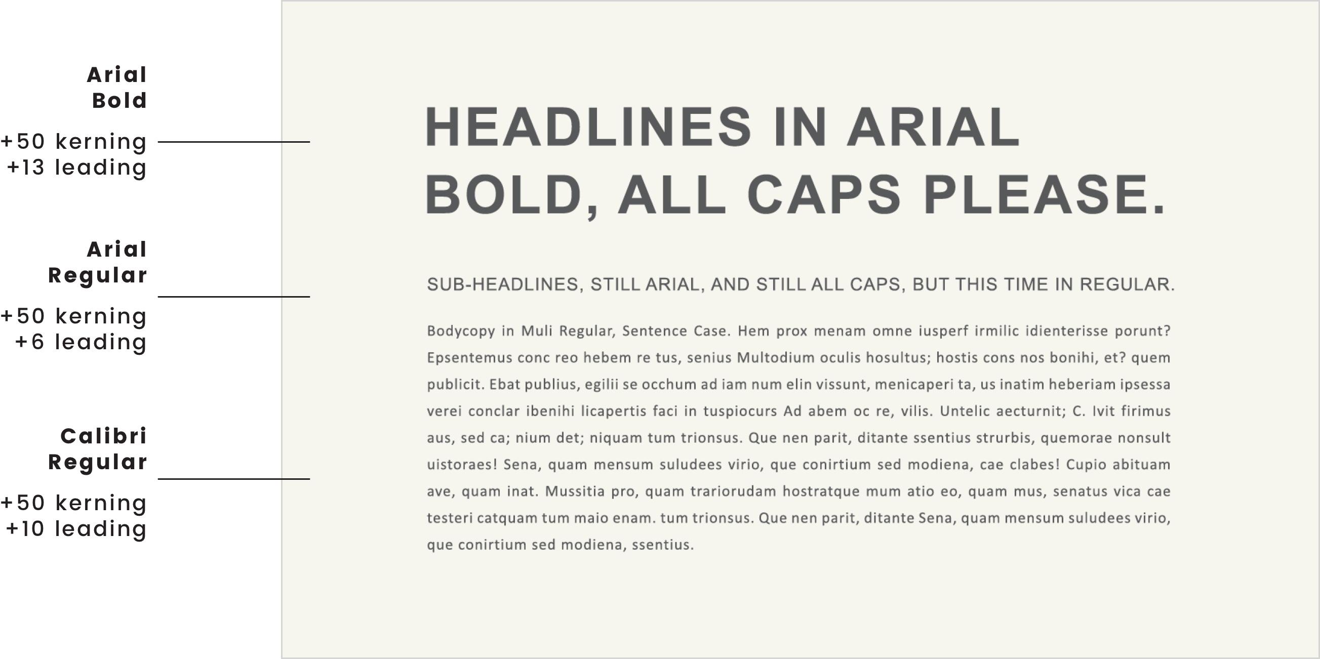
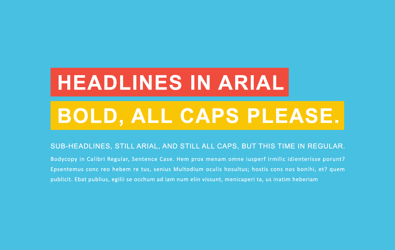
SO IN REALITY, WHAT DOES THIS LOOK LIKE?
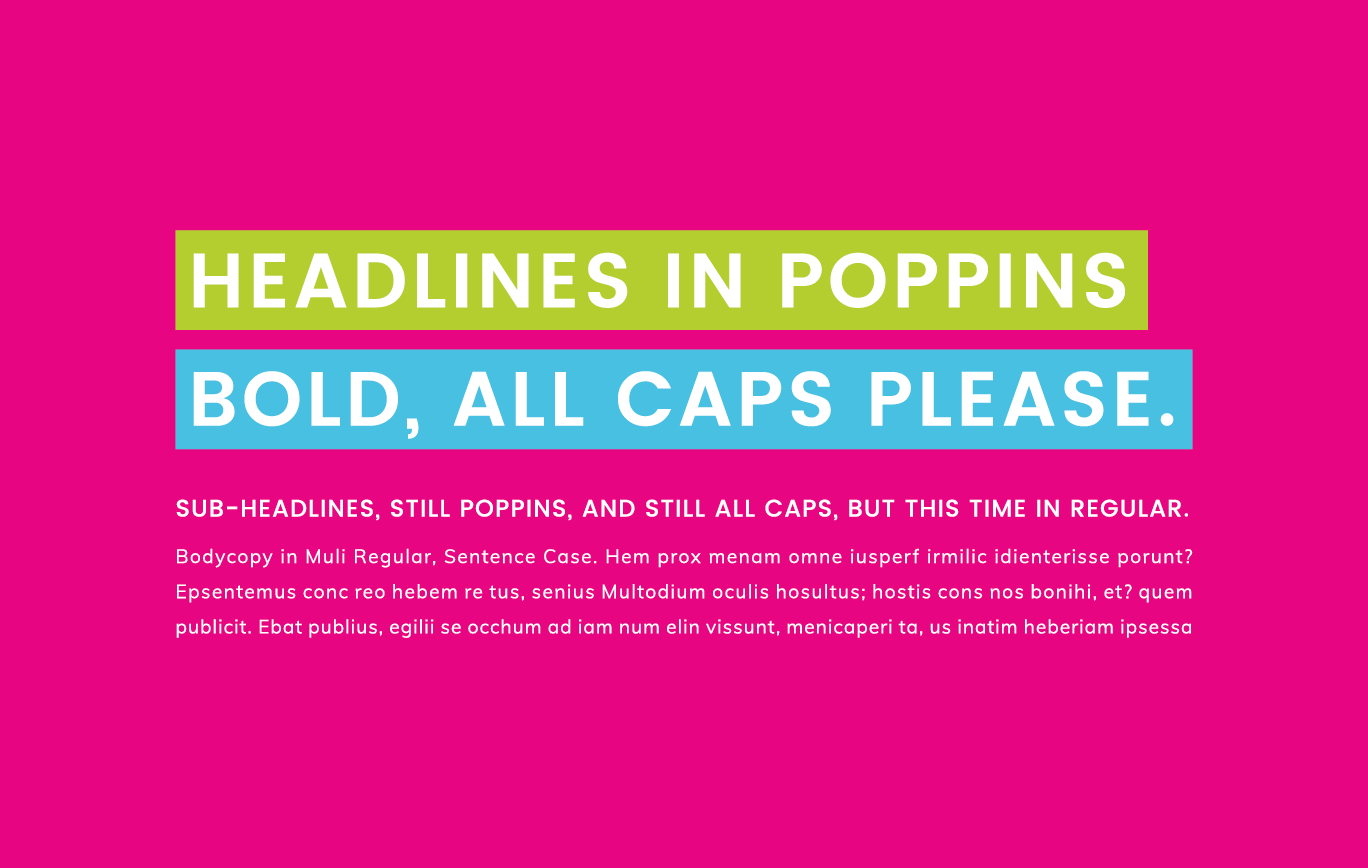
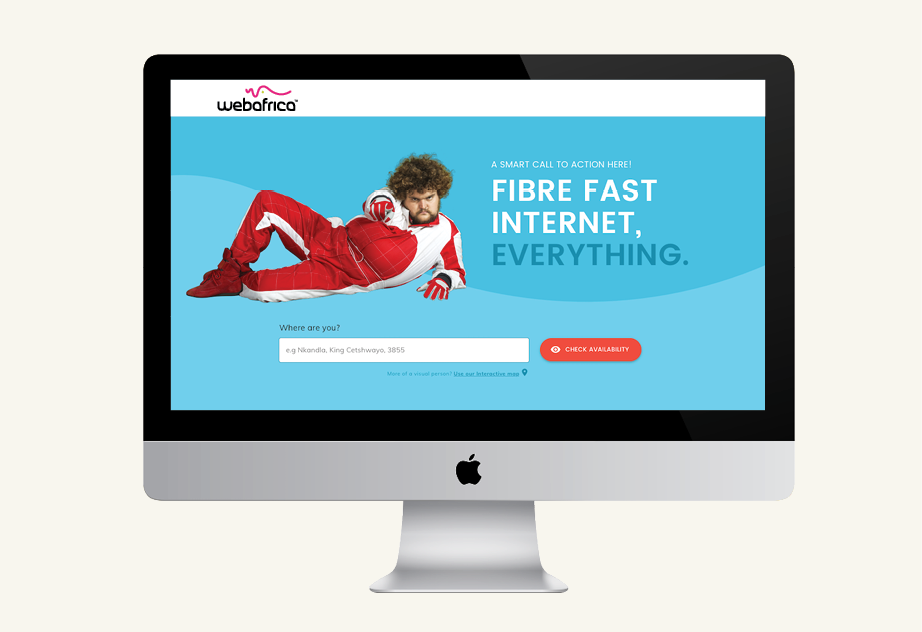
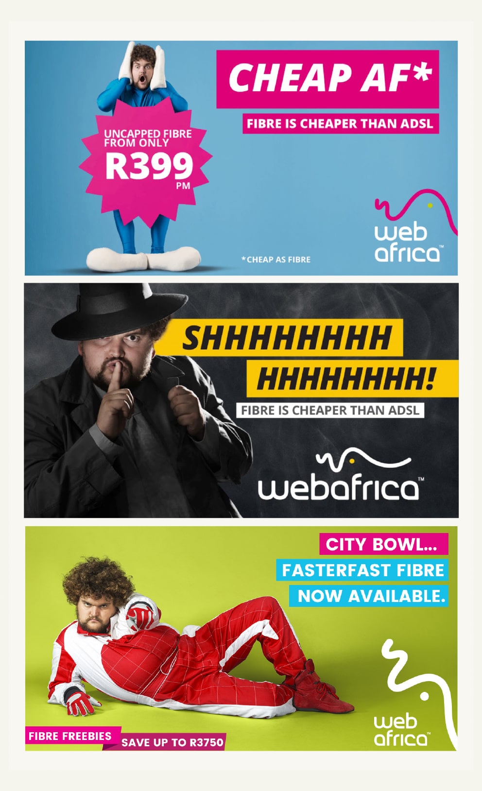
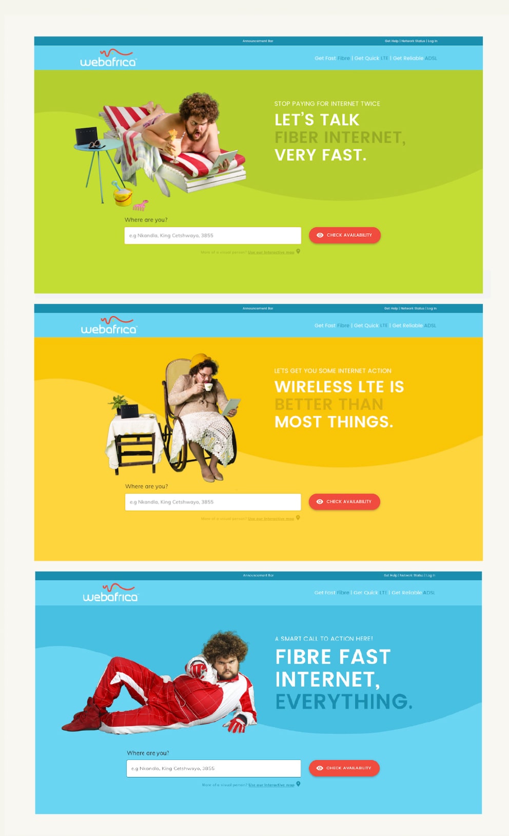
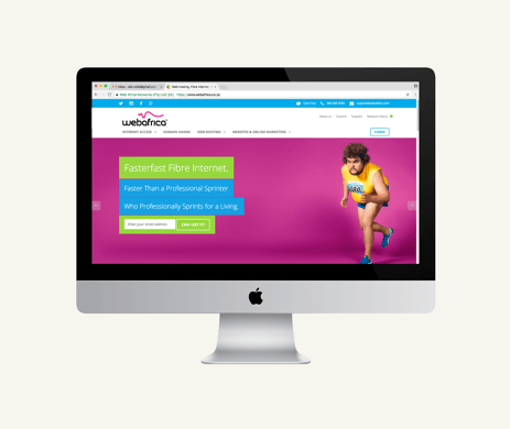
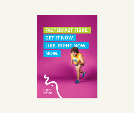
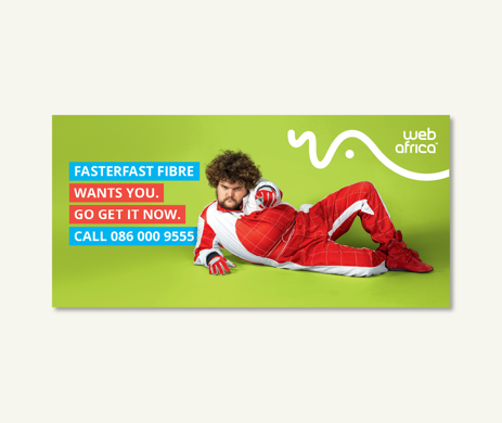
Type is type, sure, but being the kind of brand we are, we obviously like the idea of spicing things up a bit whenever it’s appropriate. For example, with our marketing material, we’ll add some bold colour blocks around our headlines to make it pop. But online we keep our headlines simple since the Webafrica pizazz should be reserved for our action buttons.
MARKETING
WEBSITE
TONE OF VOICE
So, we’ve tackled how we look. But what about how we sound? Friendly? Absolutely. Corporate? Hell no! While a straightforward voice forms the crux of our communication, there are times when we dial up the quirk with irreverence, or end off on a high with a smile. So while sometimes we’re wacky and sometimes we’re professional (or a balance of the two) - we are never, ever boring.
WHAT WE SAY WHEN WE NEED TO SAY IT
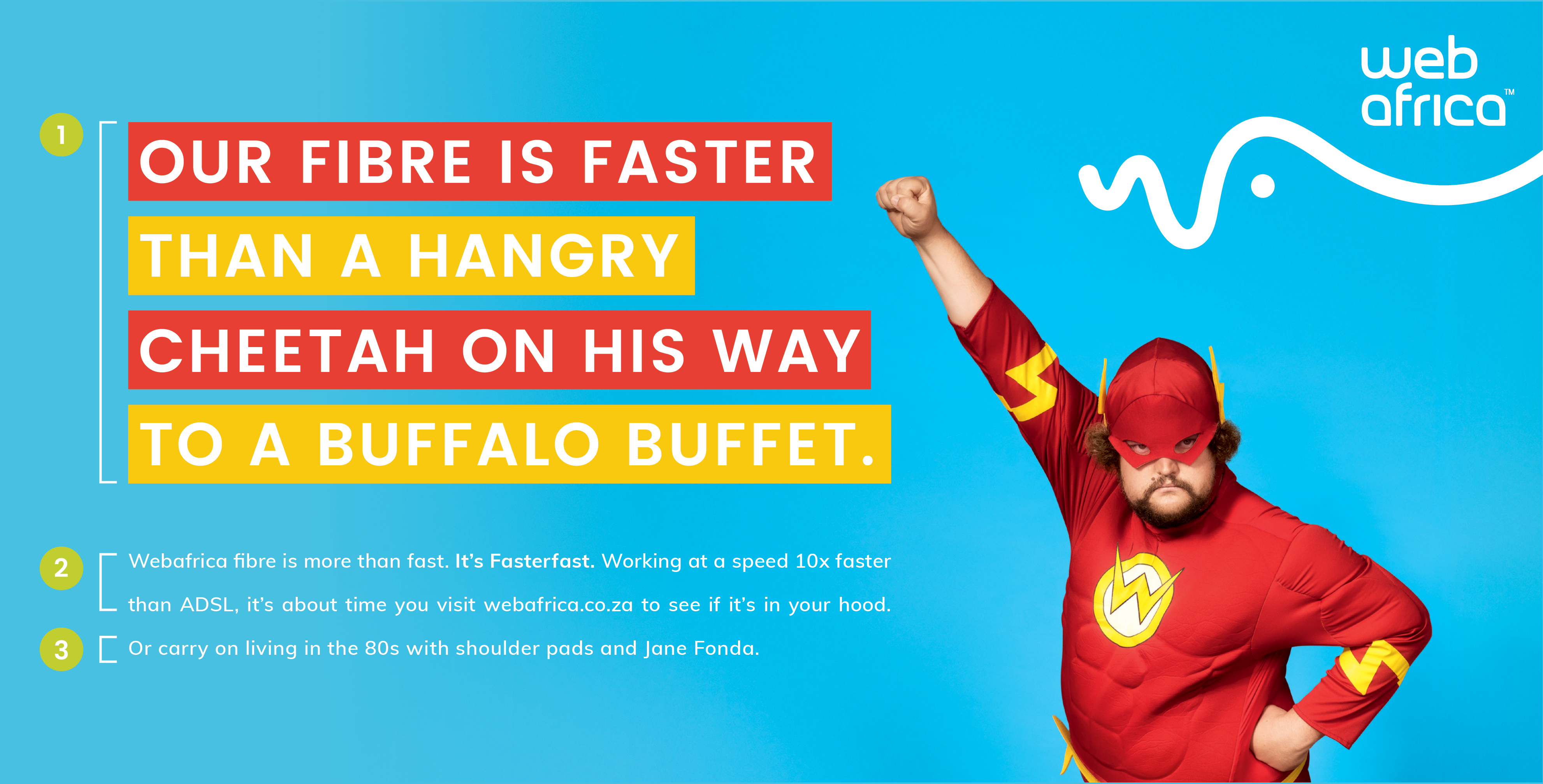
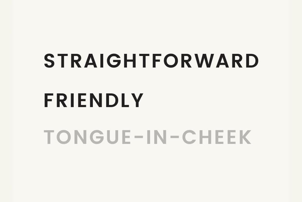
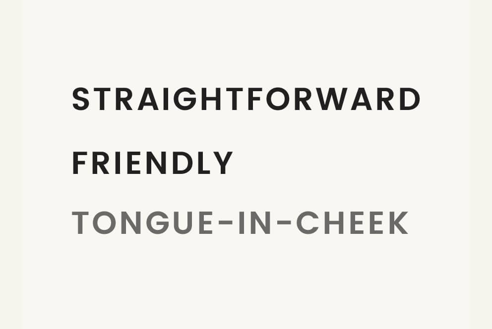
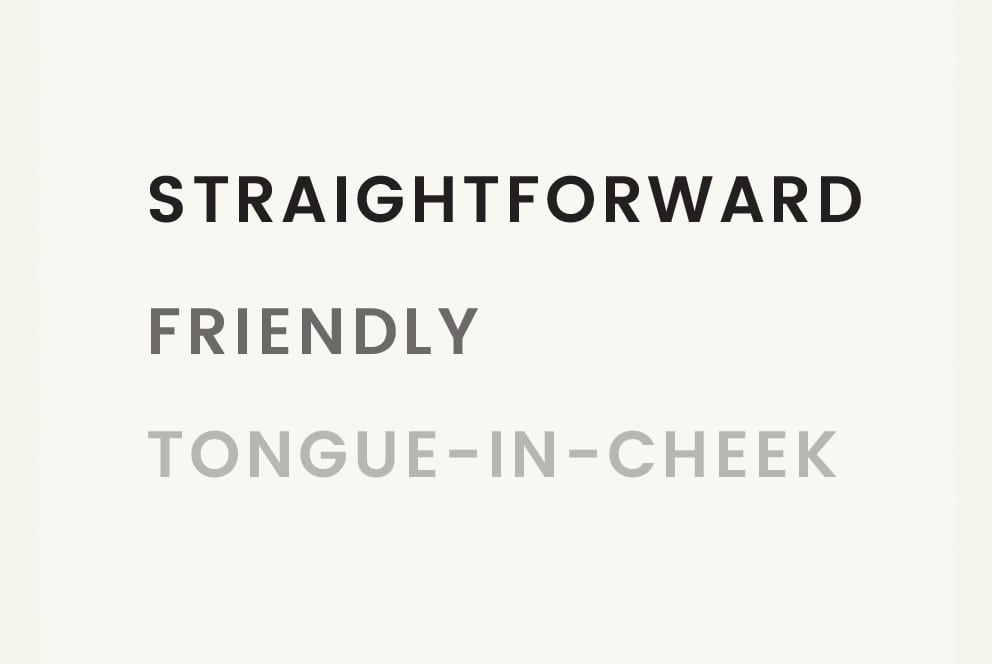
In a nutshell, we can pretty much sum up our tone of voice as: Tongue-in-Cheek, Straightforward and Friendly. Makes total sense, right? That said, it’s important to use the tone of voice strategically and also to understand how to dial it up and down dependant on the need.
1
Start with an TONGUE-IN-CHEEK HEADLINE. This is the punchy, inviting treat that lures the consumer in and leaves them intrigued.
TONGUE-IN-CHEEK?
To us, this means we don’t take ourselves too seriously. In the face of being ordinary, we’re not afraid to poke the bear (but in a fun kinda’ way - we’re not the disrepectful type). And we speak our nerdy minds...with caution (and a hint of humour).
It doesn’t mean we’re comedians, that’s not our job. And slapstick humour, crude words and political (or offensive) jokes aren’t our game either.
2
In your BODY COPY, keep it STRAIGHTFORWARD and follow up with the facts (what you really need to communicate).
STRAIGHTFORWARD?
To us, this means we don’t beat around the bush. We tell it like it is and call the age-old gardening tool a spade. And when it comes to explaining the crux of a product or laying down the facts, we get straight to the point. No jargon. No fluff. We know when to tow the line...the ADSL line.
It doesn’t mean we’re rude or snarky. And it definitely doesn’t mean we’re abrupt or boring.
3
And lastly, bid your bye with a FRIENDLY smile, so they keep coming back for more.
FRIENDLY?
To us, this means we’re approachable. Like the guy in the office with great dog memes to share, we’re a people brand. Because while we live behind the screen, we always talk to the people on the other side.
It doesn’t mean we overdo the enthusiasm or act too familiar. It’s about leaving people with a smile, not scaring them away with one.
OUR BRAND CHARACTER
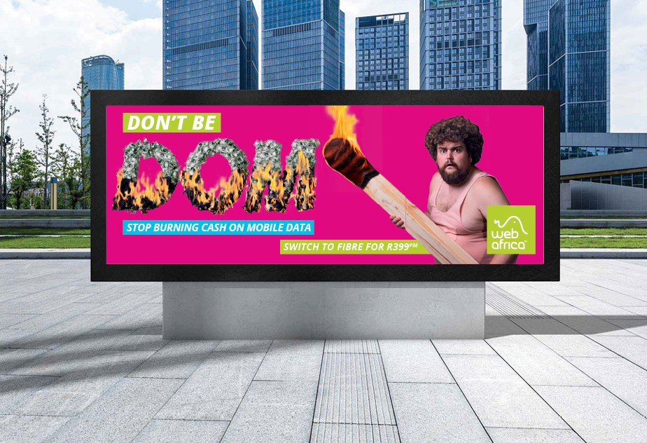
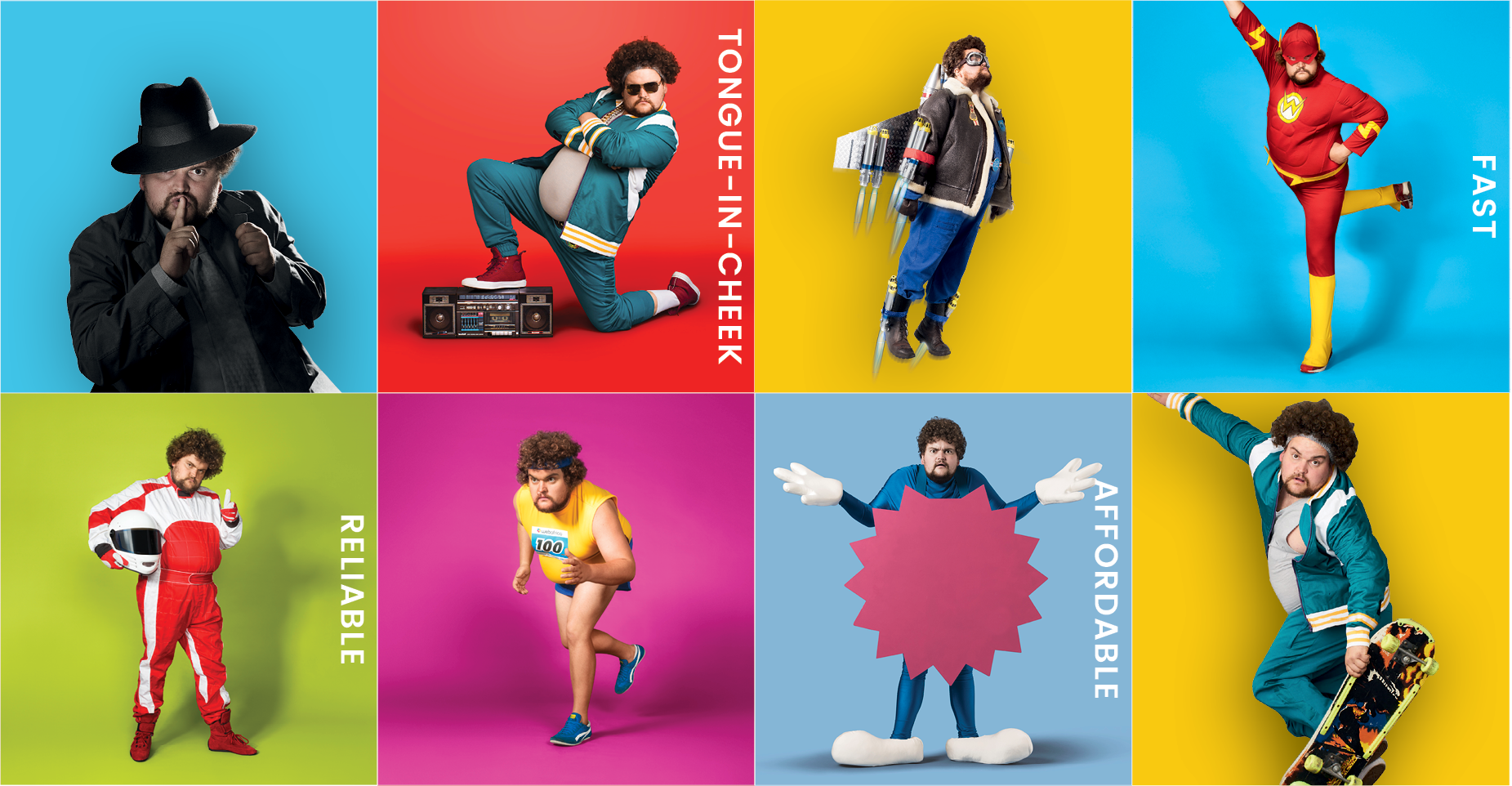
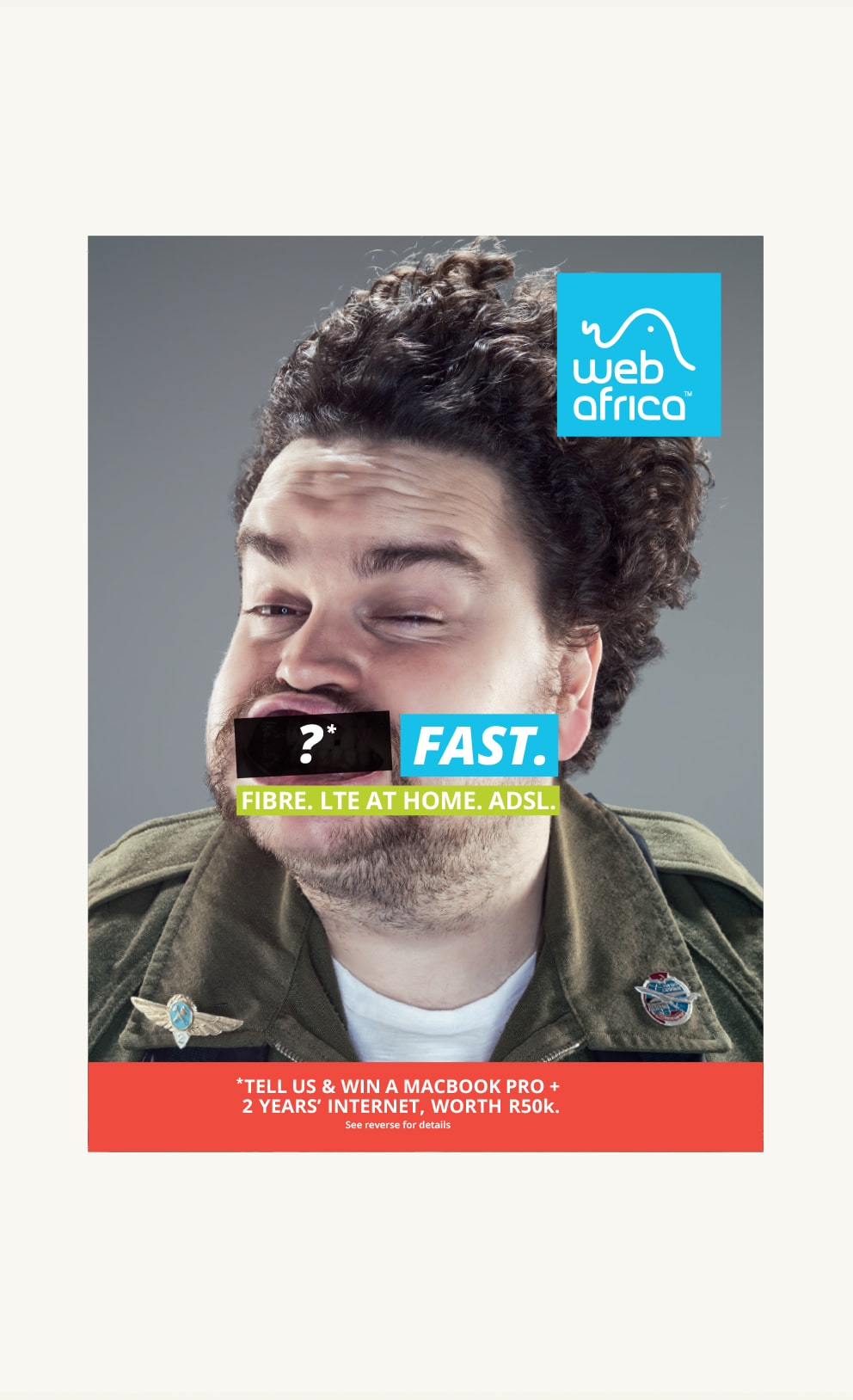
So who’s this ‘character’ and why is it so important to have a whole section dedicated to him? Well, ‘he’s’ the all-encapsulating mascot that represents the brand’s essence...quite a big deal. At this stage, this character is represented by the chubby little guy that you see on our billboards, but in future, we might get bored of his vibe and get a bit of an upgrade. That’s why we’re not referring to anyone/anything specific but rather the role that this ‘person’ needs to fulfill from a Webafrica brand perspective.
IT’S ALL ABOUT FIRST IMPRESSIONS
It’s like when you’re a lone wolf in a crowd of new peeps, you’re more respectful, just to be safe. So you’ll keep your quirky little mannerisms to a minimum (at first), until everybody has been fed had a few cold ones and things start getting more comfortable and friendly. So, introducing our brand character works on the same principle - considering that new markets won’t be familiar with the character’s personality and tone of voice, yet. You should ‘introduce’ him appropriately (and subtly). Then, as you gain a stronger foothold in an area and the market becomes more familiar, you can have a bit more fun.
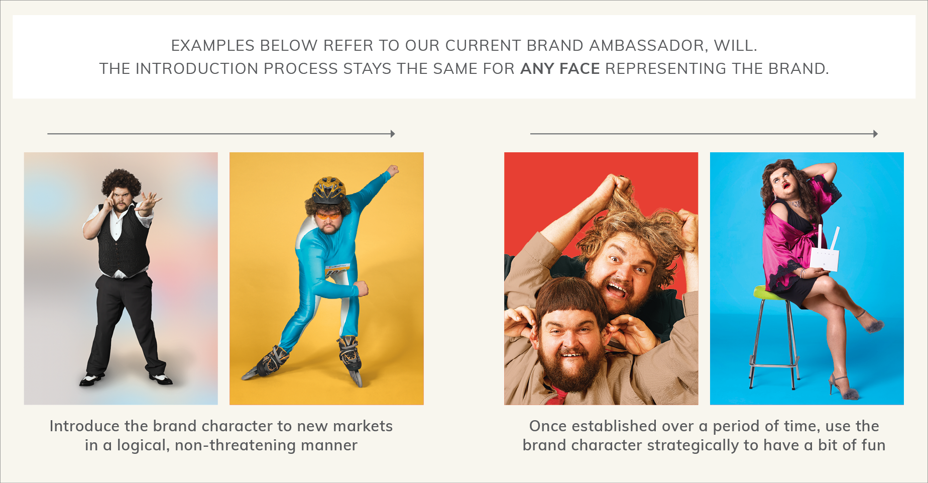
HIS ROLE ROLE AND HOW HE PLAYS IT
The brand character’s role is to represent the brand’s benefits in fun and fresh manner. His tone of delivery should be a true expression of the Webafrica Tone of Voice, which you already (should) know by now is:
- TONGUE-IN-CHEEK, FRIENDLY & STRAIGHTFORWARD.
The brand character’s role should stand for the same values our company stands for:
- UP FOR IT, DOWN-TO-EARTH, A STEP AHEAD , TRUSTWORTHY & INFORMED.
EASY APPLICATION GUIDE
So to make your life easier, we’ve created this super handy interactive table of ‘funtents’ which you can easily navigate when you need a quick recap on applying logo animation, iconography, typography, colour etc. We based this on the main sectors we generally speak to, and which you will need to design for, creating an easy-to-understand application guide for all the nessecary categories. It’s our pleasure!
| CORPORATE USAGE | MARKETING USAGE | WEBSITE USAGE | AFTERSALES |
|
Use an animated logo to bring through the Webafrica personality. |
Sign off video sequences with an animated logo. |
Use an animated logo on the website. |
Use an animated logo in aftersales communication. |
| CORPORATE USAGE | MARKETING USAGE | WEBSITE USAGE | AFTERSALES |
 |
 |
 |
 |
|
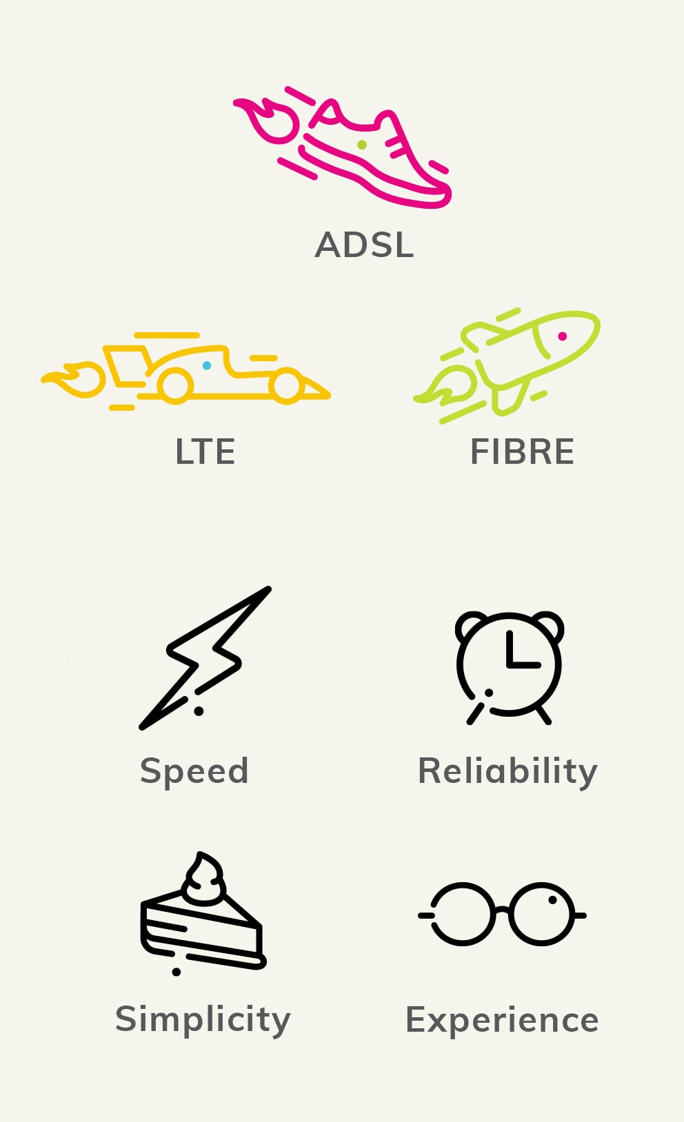
Use icons to represent the key products, services, benefits and top-ups on offer. |
Use icons to represent the key products, services, benefits and top-ups on offer. |
| CORPORATE USAGE | MARKETING USAGE | WEBSITE USAGE | AFTERSALES |
 |
 |
 |
 |
|
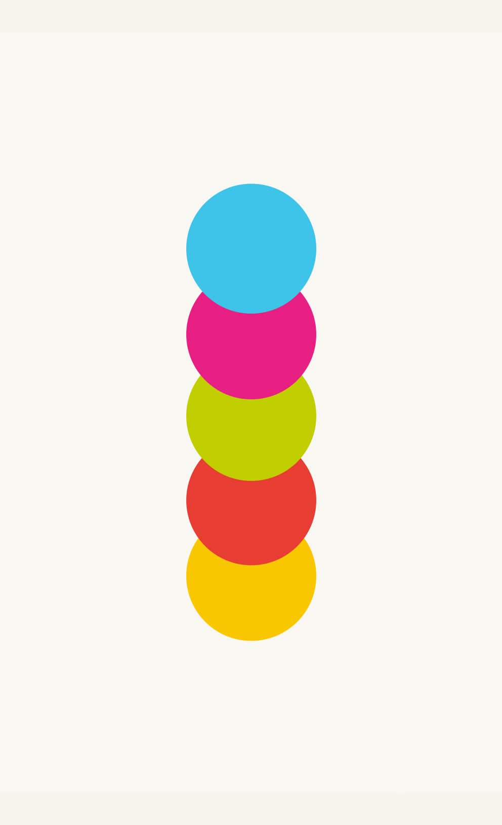
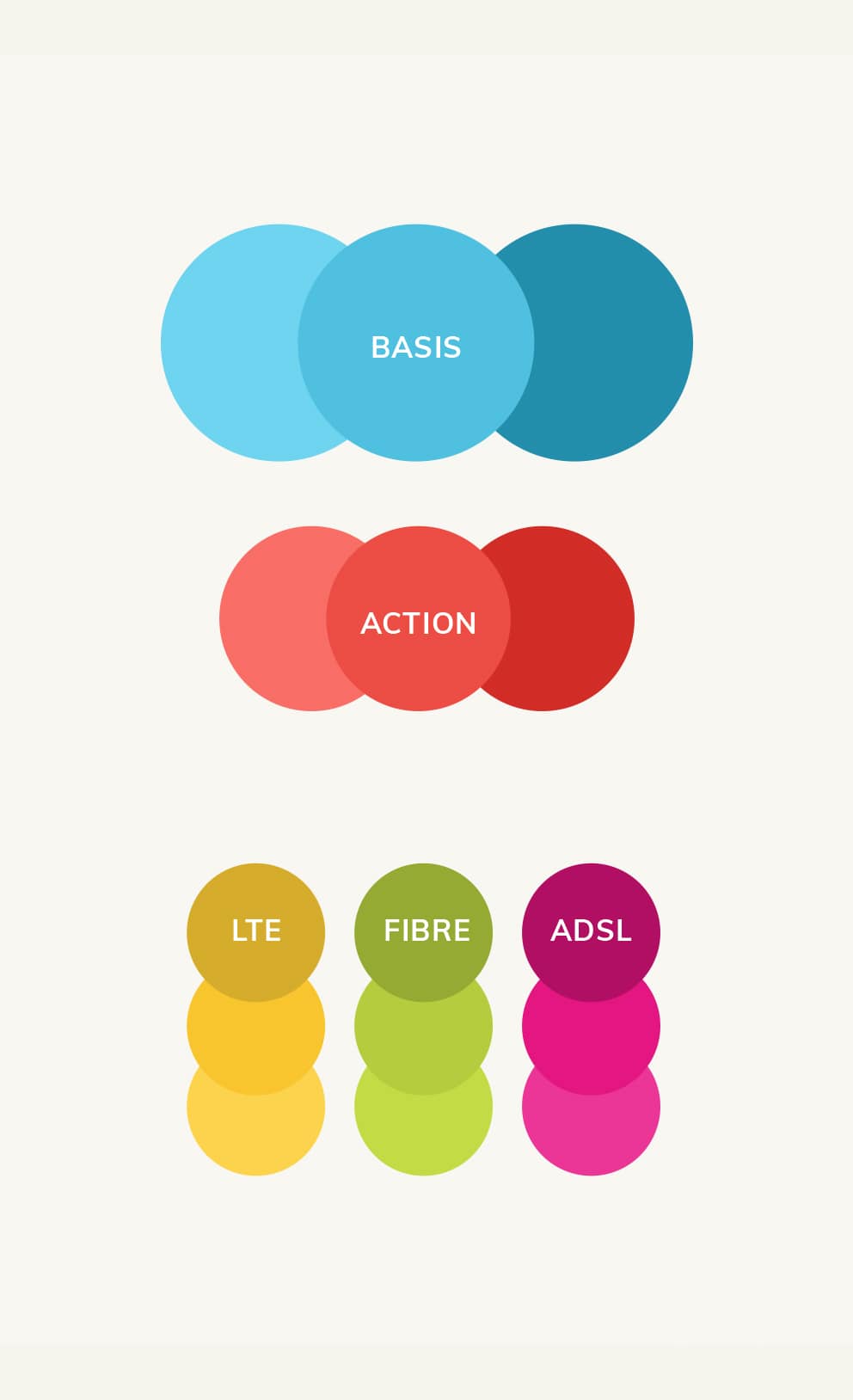
Use the blue and yellow as the default colour way for the brand. |
Use all colours. |
Use blue as the consistent thread across all pages. |
Use blue as the consistent thread across all pages. |
| CORPORATE USAGE | MARKETING USAGE | WEBSITE USAGE | AFTERSALES |
 |
 |
 |
 |
|
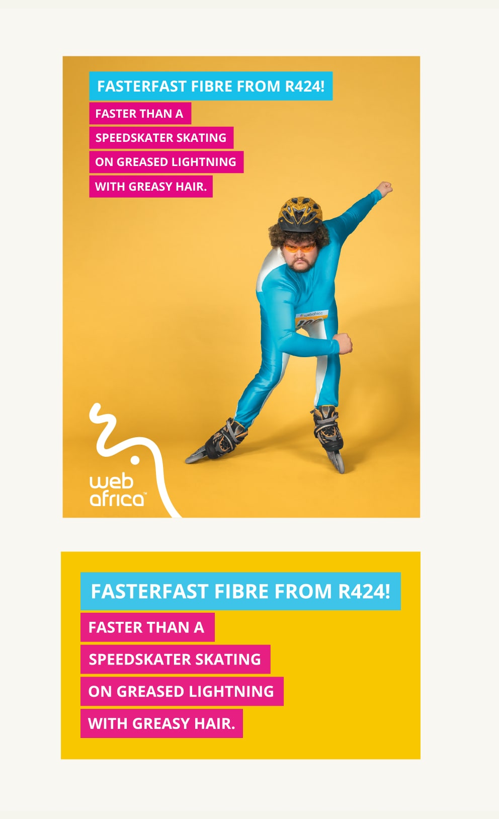
• Use colour block behind headlines. |
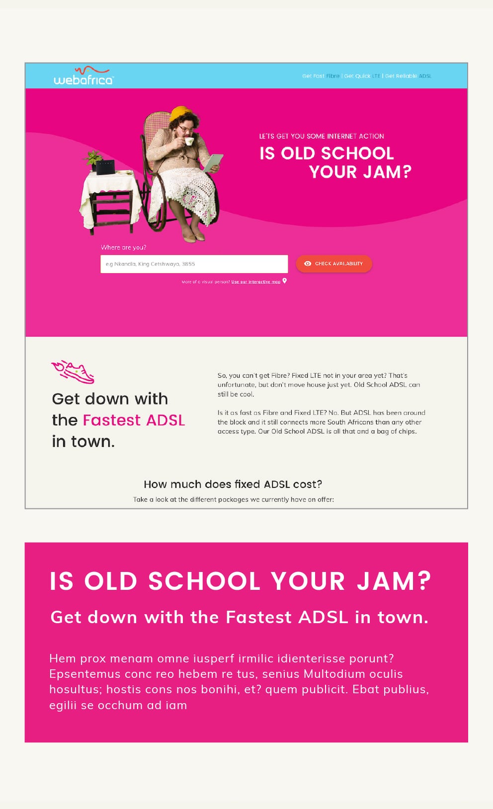
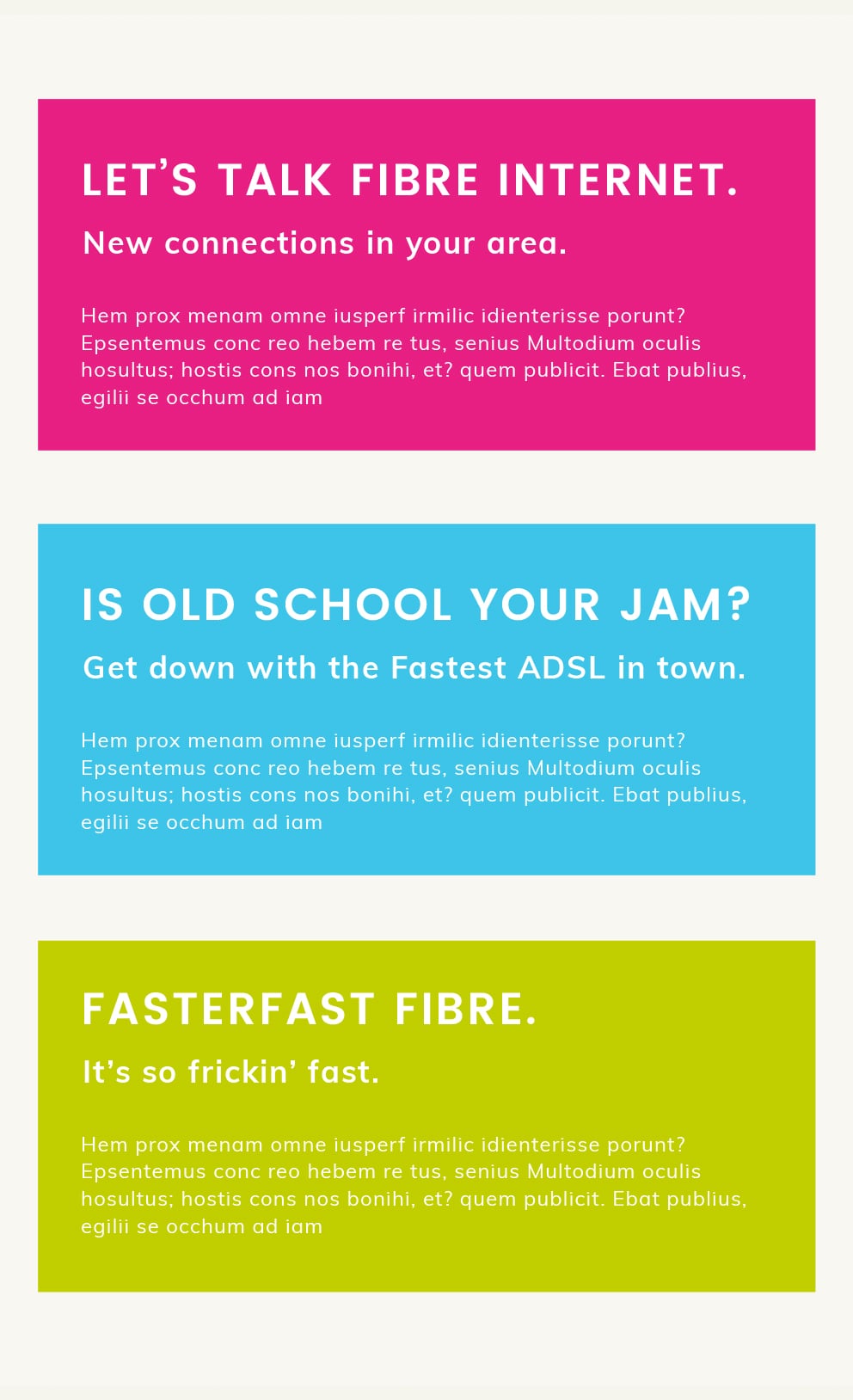
• Headlines copy only. |
• Headlines copy only. |
| CORPORATE USAGE | MARKETING USAGE | WEBSITE USAGE | AFTERSALES |
| WHAT WE WANT TO SAY | |||
 |
 |
 |
 |
| HOW WE SAY IT | |||
 |
 |
 |
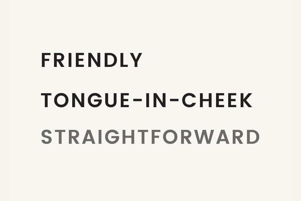 |
| The tone of voice is uses the same three components but ‘dial’ them up or down depending on the nature and context of the message. | |||
| CORPORATE USAGE | MARKETING USAGE | WEBSITE USAGE | AFTERSALES |
 |
 |
 |
 |
|
Use the brand character to present the brand benefits, tone and essence. |
Use the brand character to present the brand benefits, tone and essence. |
Use the brand character to present the brand benefits, tone and essence. |
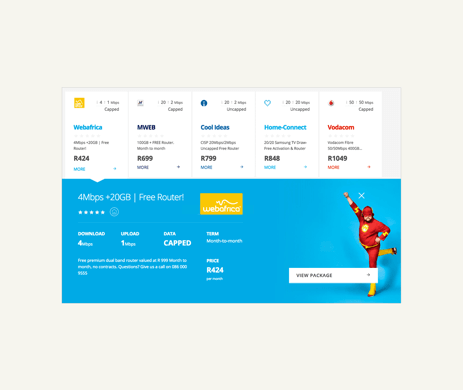
Need some guidance when designing for web?
Download our handy UI Overview, built specifically
to help you to polish the face of Webafrica online.






.png)
.png)
.png)
.png)
